Book Cover Reveal for "WHY: A Memoir"
And the symbolism behind the artwork...
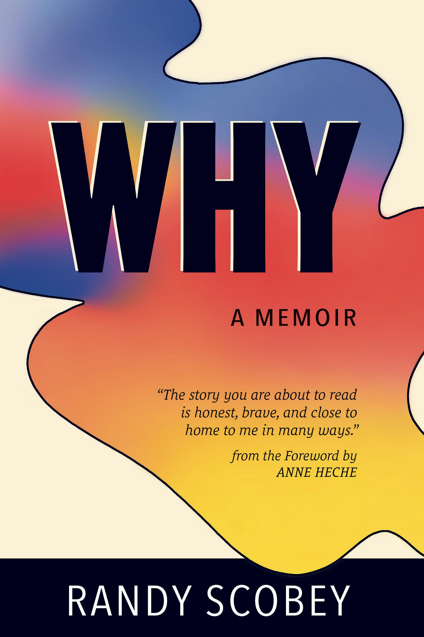
Well, here it is! The final book cover is here. What a great moment to see this project come to life. I love how this turned out!
It’s clear we live in the TV streaming age. All the platforms allow us to “Skip Intro” on shows with that capability. This option makes my husband and daughter slightly annoyed when we begin watching a series together because I demand that we watch the intros of the first and last episodes of whatever series we are watching. I do so because the intro, in my mind, always symbolizes the entire show (or should). The intro has clues and can bring depth to our viewing experience as we watch the show’s details unfold.
It’s the same with book covers in one still frame. It needs to communicate the tone of the book and invite the reader into the story.
On that note, below are the thoughts behind the cover that my publishing team and I had while taking a long journey into what the cover represents and would look like. Below, I quote the notes from my publishing team and expand on them with my thoughts.
Let’s go!
The graphic is a little bit reminiscent of a stained-glass window (which is why I had the designer add the outline, as it looks like the lead outline on stained glass).
I have said for years that I have not “fallen back” into sin but grown forward in healing and maturity. This is what led me out of the stained glass closet. This part symbolizes the church closet I used to be in and the freedom I now enjoy. I see both symbolized because the colors within are living and moving, not static. My spirituality today supports me and does not confine me.
The color palette is rainbow-esque, alluding to pride and the LGBTQ+ community as a whole.
It is rainbow-esque, for me, to honor the truth that I am back in the community I was never supposed to leave, much less turn against in my ex-gay days. I am very proud to be a part of the LGBTQ+ community now, doing what I can to make amends and help others out of (or stay out of) that world.
I am glad that this blending of the primary colors calls us back to the basics of being a growing and evolving human.
The fluidity of the graphic is about the fluidity of life, and more specifically your (Randy’s) journey.
Speaking of story-telling symbols, a river is one of the strongest and most enduring symbols in the visual and written arts. Whenever you see a river mentioned in a story, pay attention to the “journey” the main character is on. In this context rivers bring revelation and show the direction the main character, or story, is headed in.
When I saw this design and its flowing motion, that river symbolism was the first thing I grasped. It's perfect since this is a memoir of basically going on a harrowing journey toward true self-actualization.
The WHY - is as we discussed. Neither a question nor a statement. It just is.
I thought it was brilliant when my publisher recommended “WHY” as the title. It invites a wide range of readers to approach this book with an open door right where they are at with what’s on their minds.
The "black" is actually "dark navy blue" - to represent that things are not always what they seem.
This actually caught me. I thought it was a black outline, but dark blue is much more natural. If you look at a real-life river, many of them have naturally carved out paths because of water erosion over time. They aren’t prison bars but solid reference points of the life of the river. So this part representing “things are not always as they seem” is perfect.
An example would be that some will look at my past in the ex-gay cult and assume that I was raised in the church and always lived there... not true. I think this book will be surprising and eye-opening to some assumptions, not facts, about Exodus and myself.
And the above is not a defensive statement. I can see the reasons why assumptions can be made about these topics. This is one of the reasons I wrote this book: to expose details to help the reader see the truth as I see and experience it. Hopefully the reader will be inspired not to make the same mistakes and move toward their own path of self-actualization.
The graphic overlaying the edge at the bottom is about things not always being tidy while also about having the freedom to be yourself and not adhere to strict lines.
The background is not white, it's a soft cream, because life needs to be soft, especially when it's hard, and because nothing is ever truly black and white.
I love all of this. I don’t think further expansion is needed. This is exactly what those elements are about.
The previous subtitle will move to the back cover, which will be joined by a short description of the book, a brief bio, and advance reviews/praise for WHY.
The previous subtitle read, “I SURVIVED Abuse Only To LIVE A Lie Before Learning THRIVE As My True Self.” This is still the perfect summary of the book, and I am glad it will be on the back cover.
That said, Anne Heche’s statement on the front cover is powerful, and I am honored she agreed to write the forward (six weeks before she passed). I am deeply moved whenever I see her name and read what she wrote. I am glad a quote from her is on the cover. She was key to getting this memoir process going.
To Conclude…
In the past, when I contributed to books, the publisher never let the author actually participate in the title and cover design process. That’s why I know this is the right publisher for my book. They let me know every step and invited me to chime in when needed.
Thank you, publishing crew!
I am thrilled for this important milestone in the life of WHY. It is slated to launch on my birthday, May 14th; I am very happy. If you want to be notified directly by my publisher about pre-ordering and when it is officially launched, click the screenshot below and the orange button that says “Notify Me.” You can also subscribe here on my Thrive substack (there is a free subscription option) for the ongoing details of the book’s progress.
Thank you for reading and for your support. Love y’all.
Important Links For WHY (my memoir)
I appreciate your interest in my memoir, WHY, which will launch May 14, 2024. Here are more links to posts and resources about the book… Here are several online resources being utilized to help with updates and opportunities. Here are a few links you may be interested in:


Congratulations on the cover!